Week 2: Spatial
Writing
If UPS keeps their promise, today is the last day before I try my first spatial computer: my Apple Vision Pro delivers tomorrow. My social media feeds have for days been covered in people’s impressions as they try it out, and begin to adapt to computing in 3D. To start, Apple has made the majority of its apps simpler 2D experiences translated into 3D space, and the majority of app developers lack the skills/resources to produce immersive 3D experiences, and will instead port something more resembling an iPad app to 3D space. Yet even with 2D experiences, I’ve seen many comments about accidentally leaving windows in random places around the house, needing to retrace physical steps to find virtual objects. (There are software accommodations for this as well.) It’s notable that Apple’s first ad since the release of Apple Vision Pro centers the unexpected delight of having tactility of digital objects, watching how they interact with the physical spaces we’re well-accustomed to.
Part of what makes the VisionOS workspace seem so expansive is that it’s utterly natural to make use of the Z-axis (depth). While dragging a window, it’s as easy to pull it closer, or push it farther away, as it is to move it left or right. It’s also utterly natural to rotate them, to arrange windows in a semicircle around you. It’s thrillingly science-fiction-like. The Mac, from its inception 40 years ago, has always had the concept of a Z-axis for stacking windows atop each other, but with VisionOS it’s quite different…
As he mentions, our 2D computer screens attempt to make use of space already; what’s wild is the simple effect of adding a drop shadow (one line of CSS!) provides a convincing effect on the Mac, where you can remember certain apps are “behind” what you’re currently looking at based merely on two different levels of drop shadow. On visionOS, the spacial cues are stronger because the windows appear floating at different depths, and moving your head or body, you can see them back there.
I’ve used memory palaces to remember information for exams in high school before, and the technique can work well. Our brains evolved to be great at perceiving spaces, and remembering navigational cues so we don’t get lost (and eaten by wild animals in the middle of the forest). The future of user interfaces I have long believed will become increasingly immersive, interactive, real-feeling. Users don’t need stitched leather and green felt skeuomorphism to understand what apps do anymore. But a sea of flat white and grey and blue is, full stop, harder for human brains to understand, and utterly unmemorable, because our brains did not evolve to live in Bauhaus-descended spaces of aesthetic minimalism. Providing spatial cues through great sound and haptics, lighting and shadows reacting to the room around us, incorporating ever-more accessibility accommodations, and bringing virtual objects into our physical field of view will make the next generation of software feel more meaningful and inclusive than what came before it.
Our eyes are shockingly easy to trick, and surprisingly adaptable. Those of us with two fully-functioning eyes are used to our stereo depth perception, but if one is covered, we immediately adapt to having only one vantage point. There’s no shortage of optical illusions we all fall prey to. Ultimately, Apple Vision Pro is simulating reality through cameras and high-resolution displays, calculating the geometry of vector objects to make them feel present in our realities. But everyone who’s tried any VR headset of a certain quality knows our brains immediately accept it as real 3D space, even though it’s never 100% correct and we know they’re simulations. As an interface designer, I couldn’t be more excited for an era of design where we take better advantage of our brains and many senses to make memorable, useful, exciting experiences.
Making
This week, I made a quick visualization of data near and dear to my heart: the U.S. exports of liquified natural gas, from its first export terminal in the Northeast. This is a huge topic I made a project about last fall, but at the end of the research I discovered LNG Monthly, a treasure trove from the Department of Energy of spreadsheets of every natural gas shipment out of this country. I’ve wanted to begin visualizing it in 3D for awhile, so this week provided the perfect opportunity to get going.
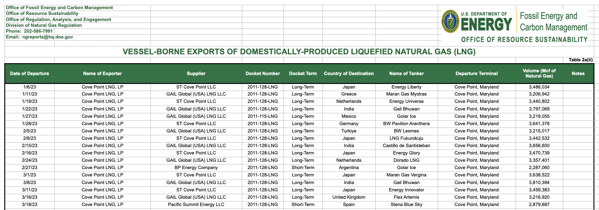
I started in Numbers, simplifying the spreadsheet down to only the columns I’d make use of, and exported as CSV.
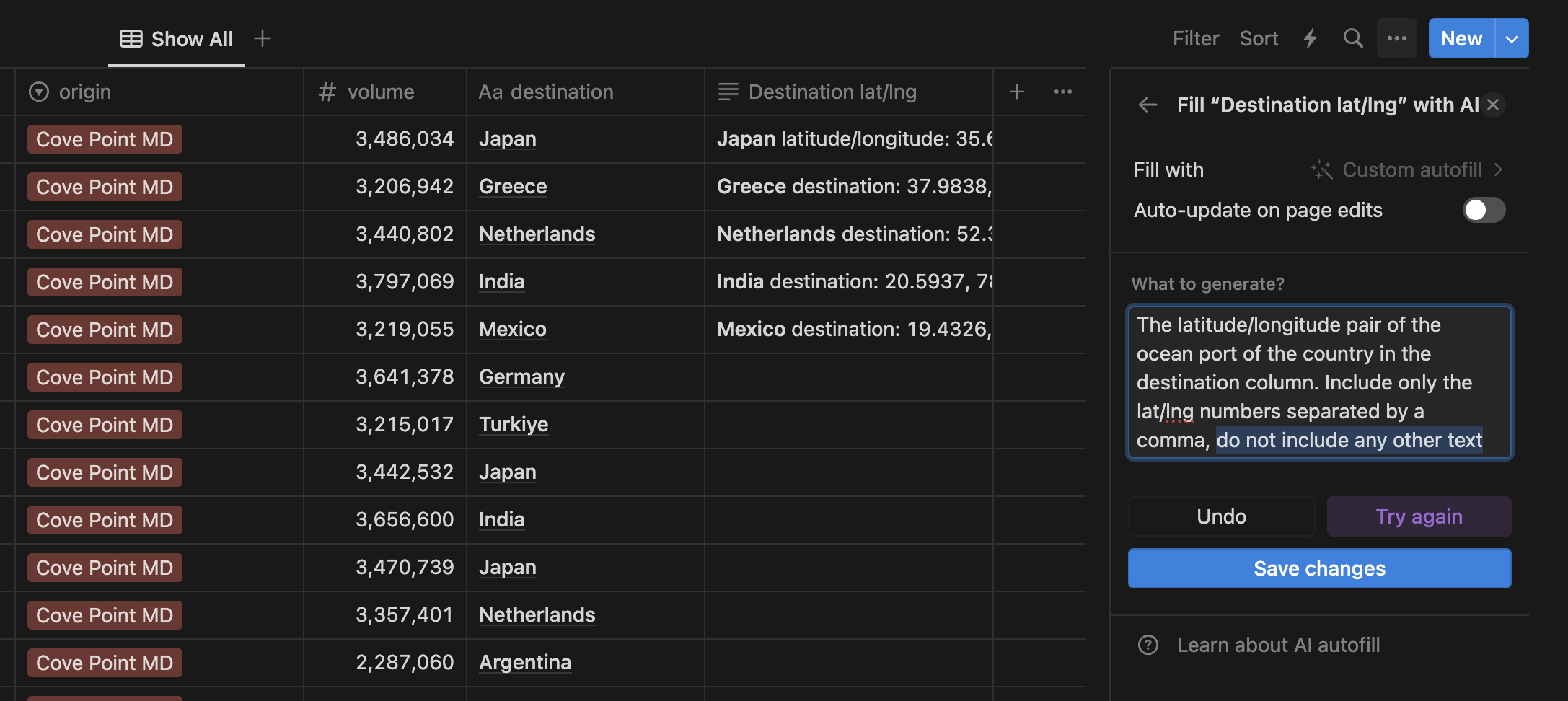
In our theme of trying AI tooling, I tried using Notion AI autofill to complete adding the latitude/longitude coordinates I needed for the visualization to my spreadsheet. This worked extraordinarily poorly. I asked my friend who works on this feature and he said using LLMs to do this was a terrible idea in general.
I then asked ChatGPT to write me a script for pulling this information, which it did. I tried running it on RunKit, and it only figured out two countries.
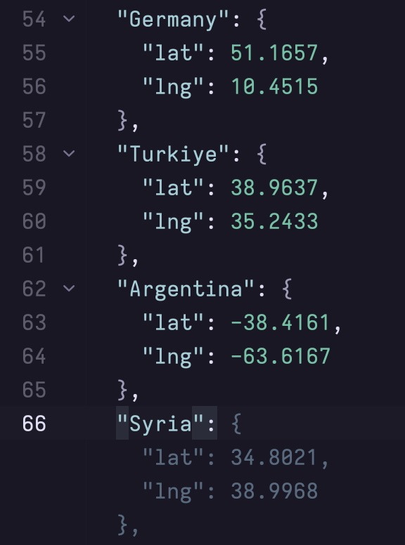
I gave up and used GitHub Copilot right in my editor, flying in the face of scientific recommendation but it was quick & easy. Peace on earth, or at least earthly coordinates.
After a quick npx csv2json, I proceeded to start coding the site. I discovered the spectacular Globe.GL library, which I made use of via React. I added the points as the other export terminals, color-coded with a legend, then the exports as arcs.
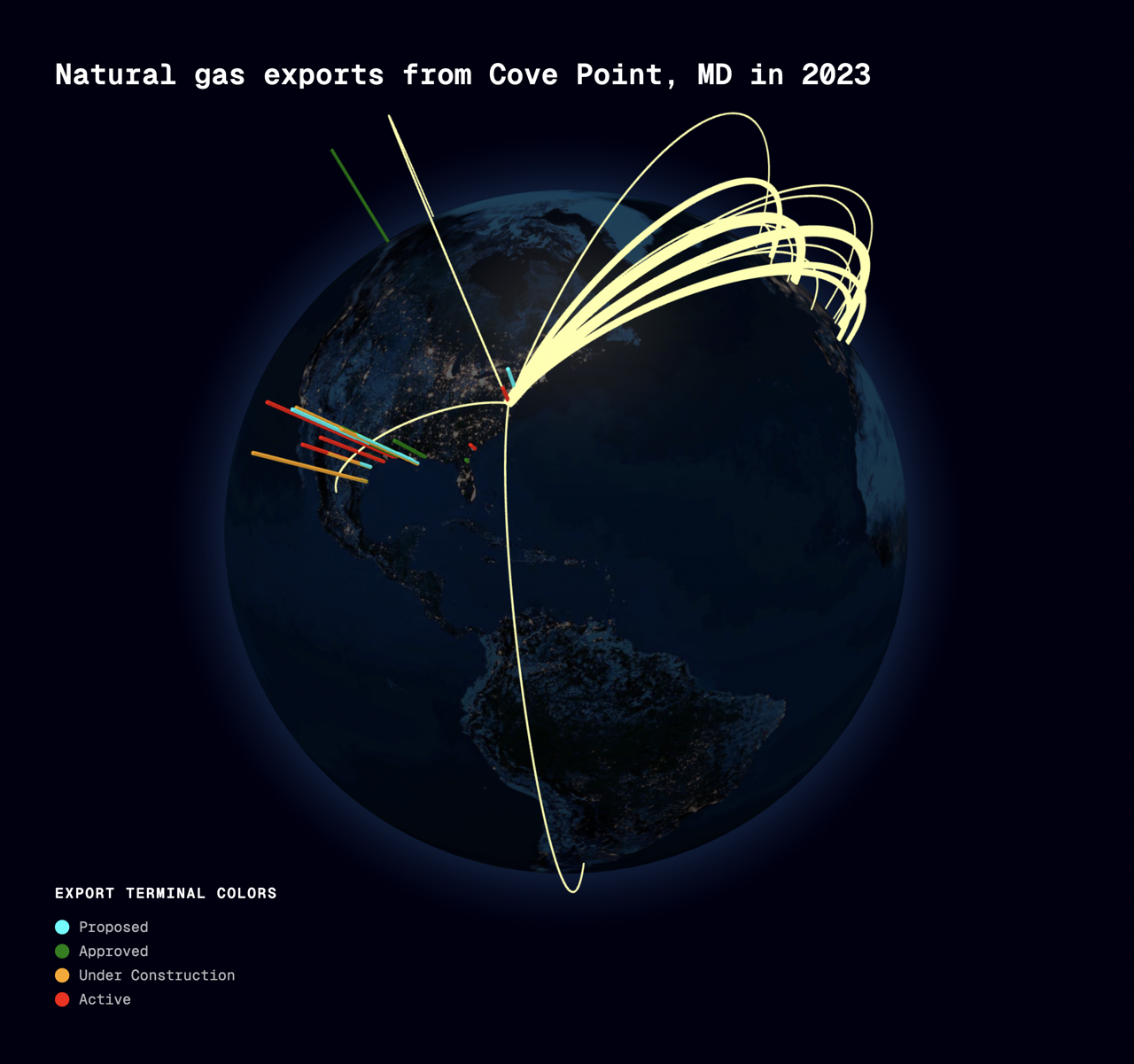
In the future, I’d like to add a switcher between all the terminals, and do an animation throughout the year with a slider, preferably in AR, but that was beyond the scope of this week.